Redesigning the PM experience for global printing
Southern Graphics Systems (SGS) bespoke ERP, MySGS, had become a patchwork of workarounds for 95% of users. I led product strategy, research, and design to rebuild navigation, the PM dashboard, and order entry, leading to improved productivity.
Led redesign of SGS's PM experience to reduce non-value-added labor in daily operational work.
Focused on dashboard, navigation, and order-entry flows where friction and workaround behavior were highest.
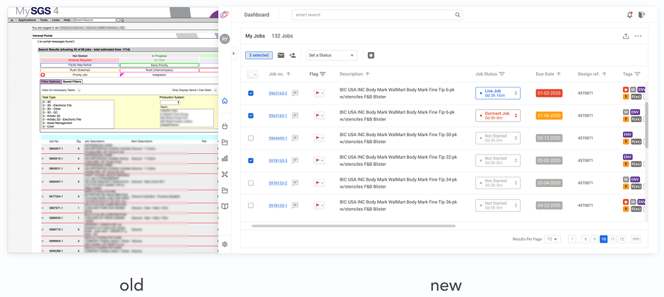
Before / After
Before: PMs relied on fragmented trackers and dense legacy surfaces.
After: next-gen dashboard and task flows improved success and reduced skipped actions.
Problem + Impact
Users spent most of their day in project management workflows, but legacy UX pushed them into workarounds and repeated validation loops. Research confirmed this as the highest leverage area for reducing wasted time.
- —+31% task success
- —-13.5% skipped tasks
- —2s average time saved on core tasks
- —5s target savings on simple tasks
Rapid-fire highlights
Information accuracy
Sheets, notes, docs — parallel “sources of truth” when the system felt unreliable.
File management
OneDrive, Box, Dragonfly, local storage — chasing the latest file outside MySGS.
Communication
Notes and paper — especially for coordinating with operators on the print floor.
Time management
Calendars, reminders, email — tracking follow-ups the ERP didn’t surface clearly.
Workarounds clustered around accuracy, file coordination, communication, and time management.
Project management — where PMs spent most productive time after a deal was won — became the anchor for scope.
Six friction areas were mapped, with project management identified as the highest-impact intervention point.
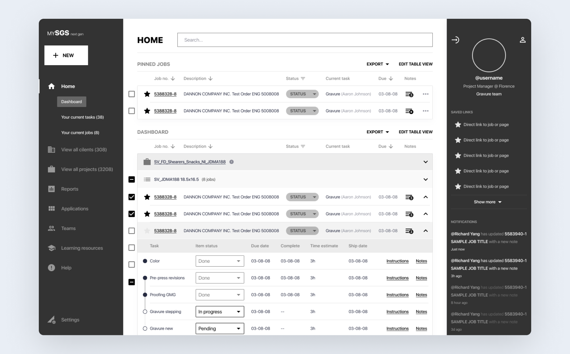
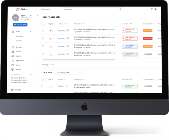
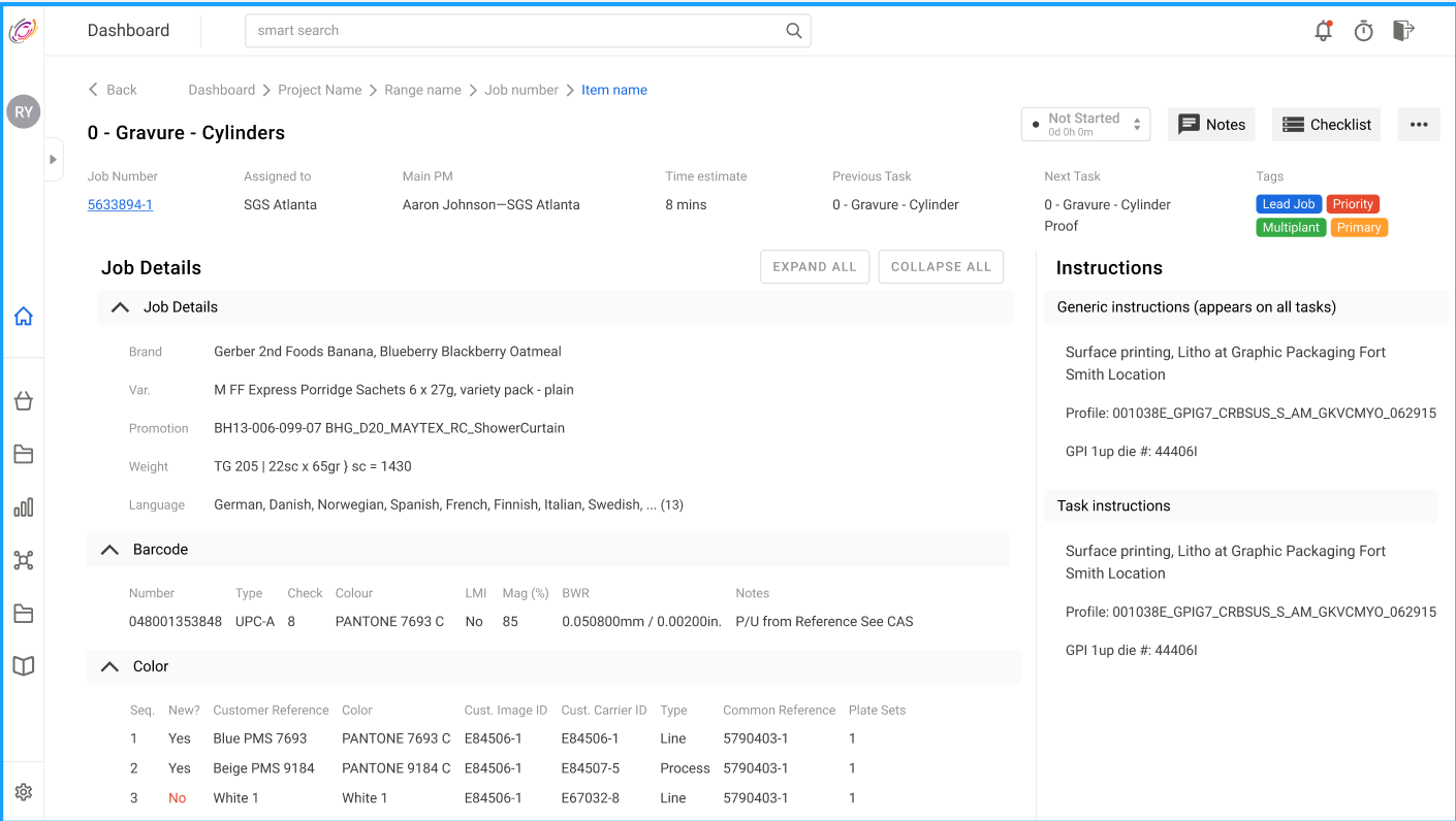
Next-gen home — annotated callouts for the core dashboard loop we usability-tested with PMs.
Next-gen dashboard balanced PM density needs with clearer task and job orientation.
Human-in-the-loop workflow architecture
Role-specific UX preserved human verification in high-stakes operational flows instead of over-automation.
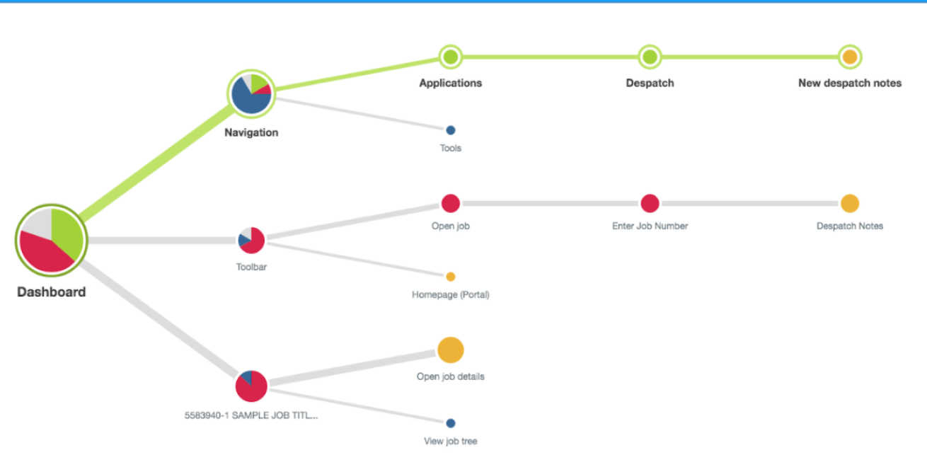
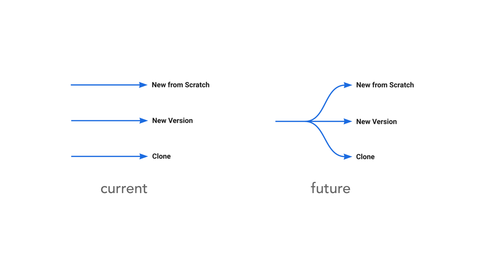
Progressive branching over upfront complexity
Labels at the fork explain when to use each path — reducing “different but same” confusion from the legacy ERP.
Decision paths were delayed until necessary, reducing cognitive load and improving task flow.
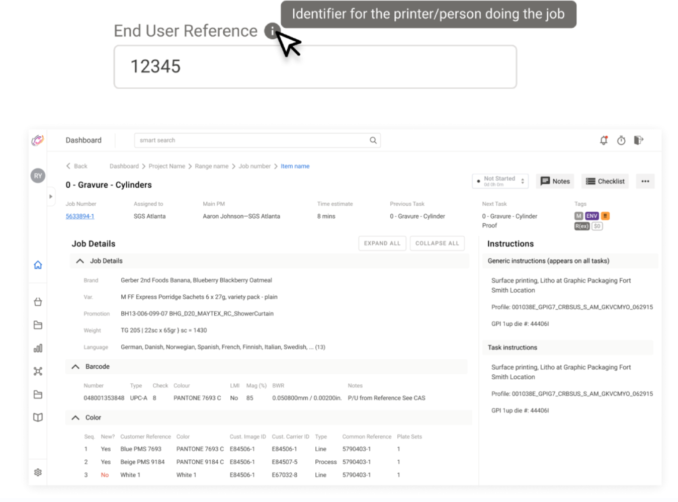
Error-state handling through visibility and reference aids
Low-fi exploration before high-fidelity convergence
Low-fi exploration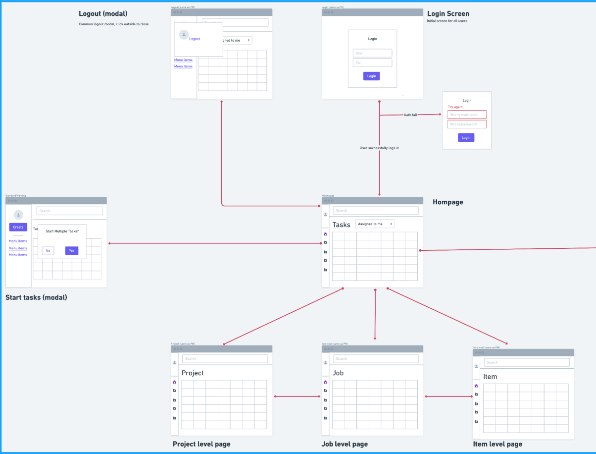
Assist-then-decide operating model
The system direction favored support and auditability over black-box automation.
Reflection
This project reinforced that enterprise UX quality is often won through structured research, workflow clarity, and role-specific decision support rather than visual novelty alone. The most valuable shifts came from letting data and user behavior define where to simplify and where to preserve control.
Next Case Study
BenchSci — Methods MVP