Designing for Scientists Who Don't Trust LLM Answers
Led design for BenchSci's GenAI pivot in Experiment Validation: a hybrid agentic chat plus evidence table for scientists who needed to see the data, not just the answer.
Before / After
Before: chat-first direction where the AI summarized and scientists re-navigated to evidence themselves.
After: hybrid interface where chat retrieves and the table is where scientists evaluate.
The problem
Scientists are trained to distrust conclusions without visible evidence. A pure chat experience sat between them and the data — exactly where they need agency. The work had to deliver faster decisions without removing their ability to judge for themselves.
Strategic move 1 — A shared frame for the work
Reframed experiment validation from a linear handoff into a web of interdependent decisions. The interactive map became the artifact other teams reused, including commercial in enterprise conversations.
Strategic move 2 — Research-led chat vs. table
 Pure conversational
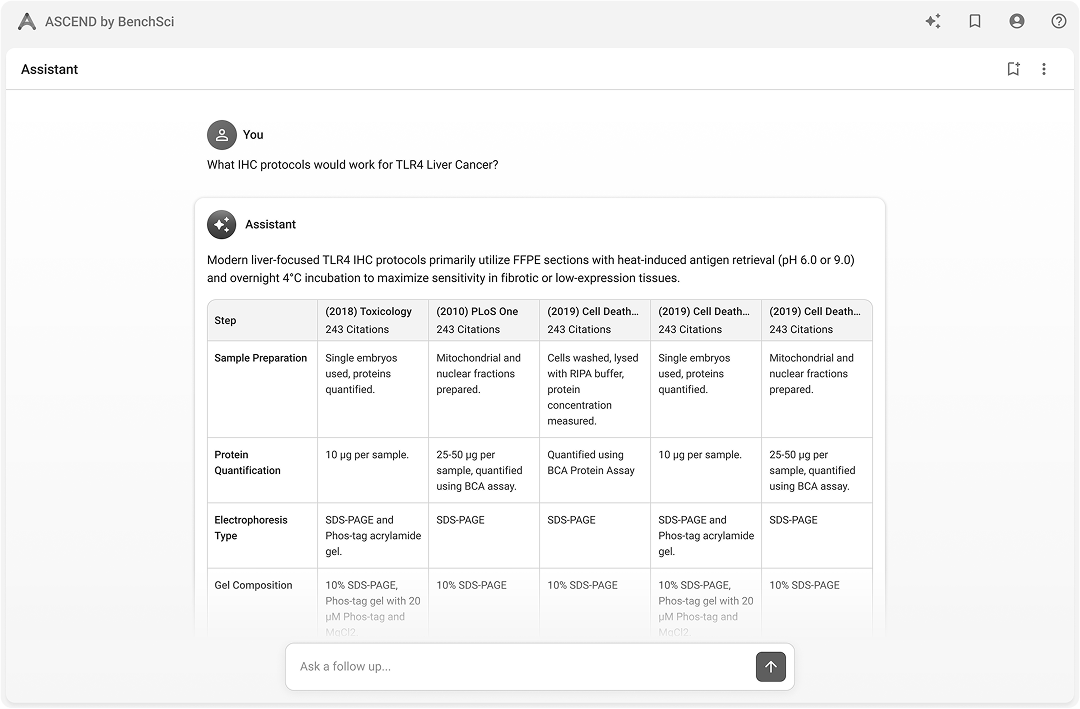 Hybrid — chat + table
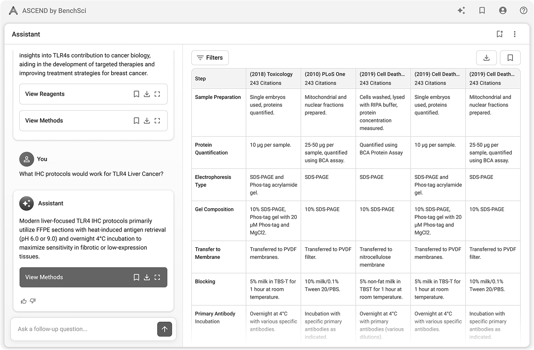 Hybrid — app first
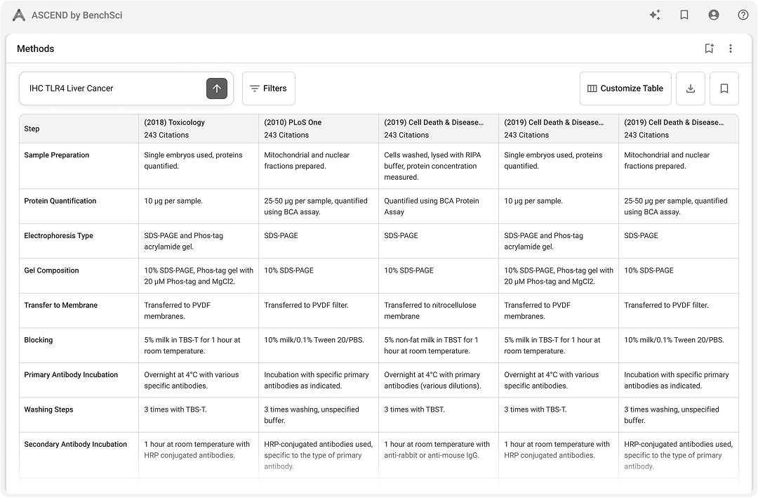 Pure app / table
Ran 15 scientist sessions against four variants — pure chat, hybrid chat-first, hybrid app-first, pure table — instead of one end-to-end prototype. Three findings carried the decision:
- —Agency: scientists rejected an AI that decided what they saw; they needed to navigate evidence themselves.
- —Trust: citations alone were not enough — visible underlying evidence was the trust unit.
- —Speed: tables beat text for scan, compare, and decide; figures communicated method quality text could not.
The design
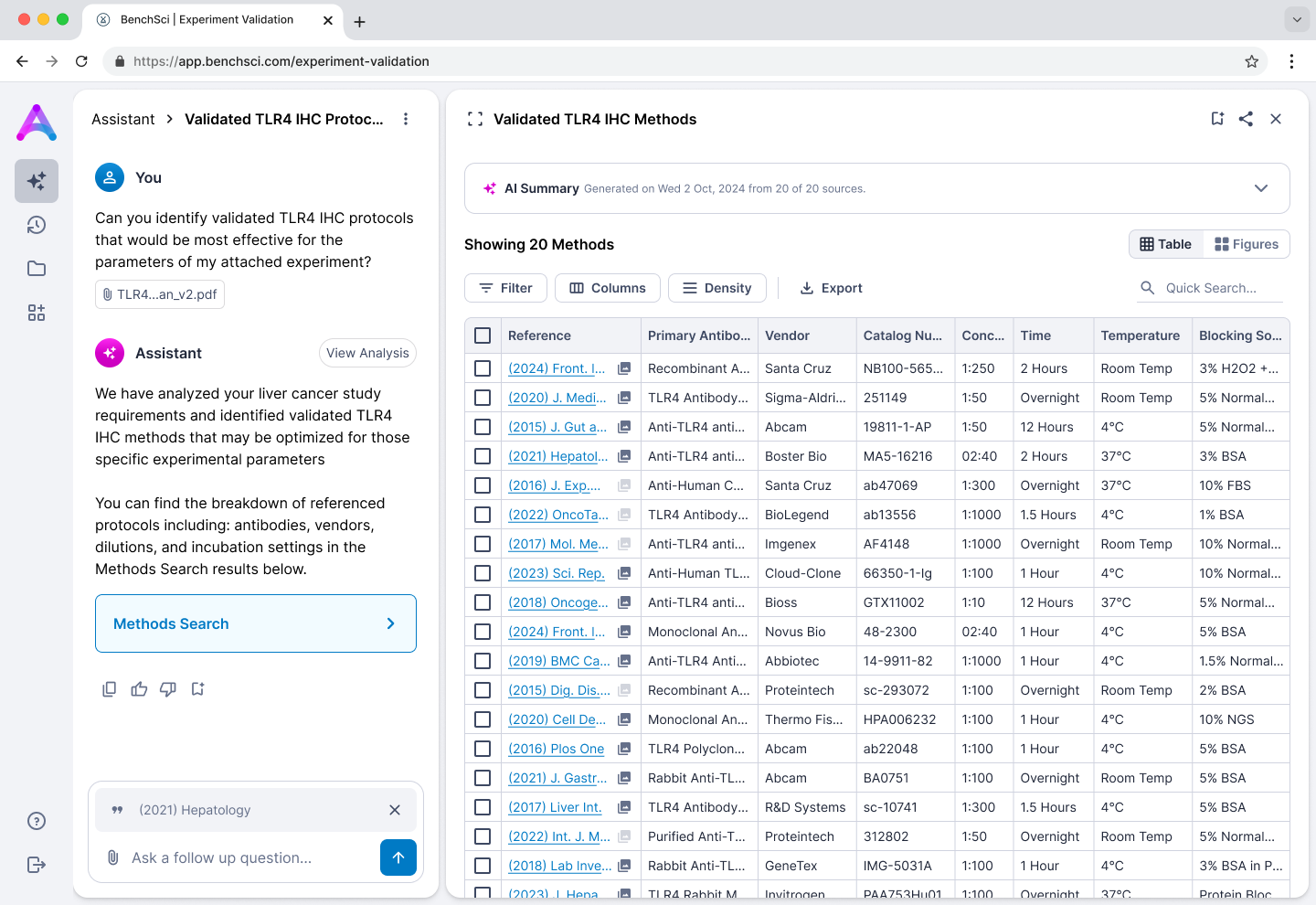
Persistent left-right hybrid: chat for retrieval and orientation, table for analytical work. Both surfaces stay in view so scientists never trade context for action.
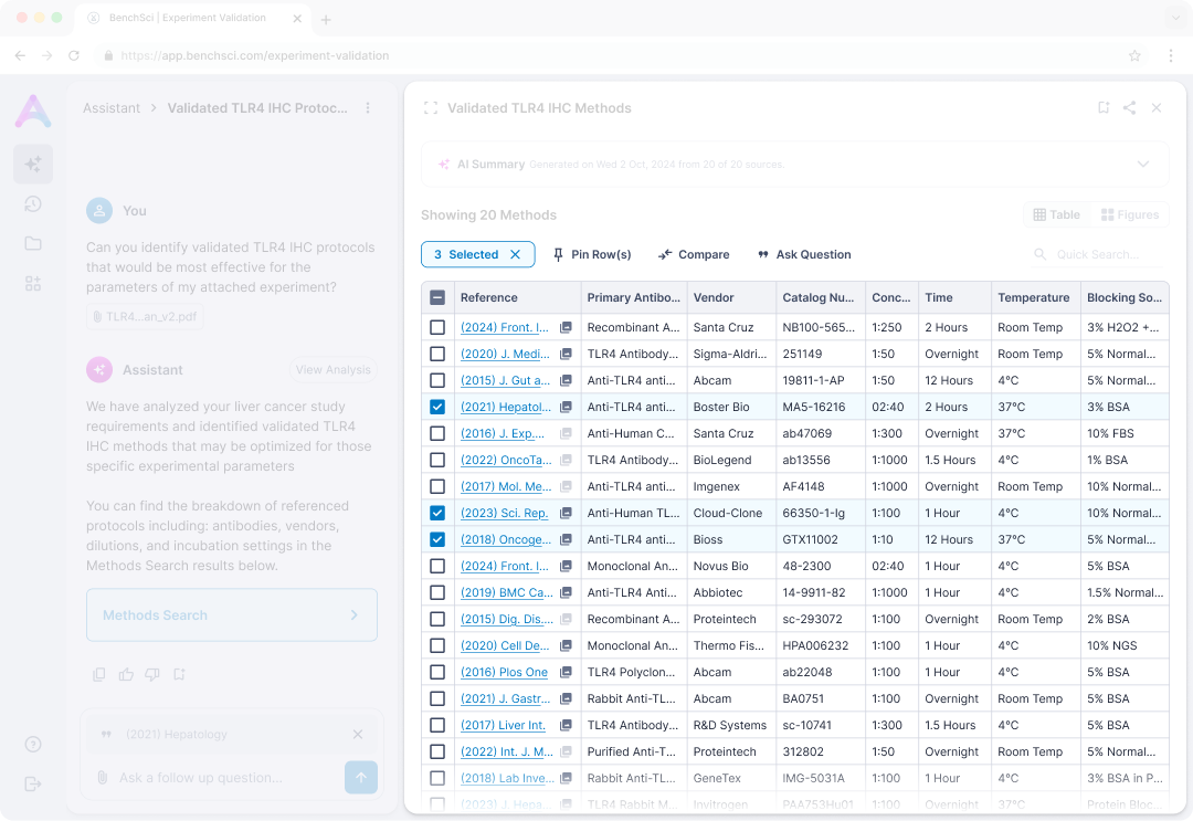
Chat, table, and evidence stay co-resident. Row-level actions like pin, compare, and follow-up run inside the evidence view, so navigation never resets the scientist's place in the work.
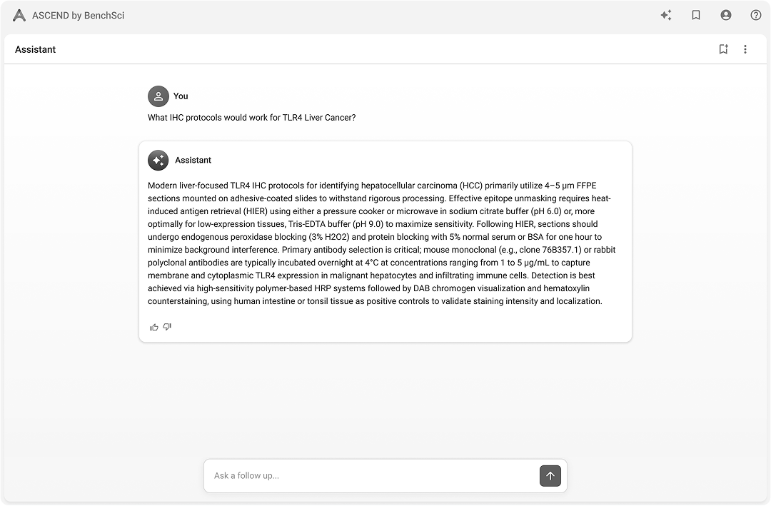
Inline evidence citations
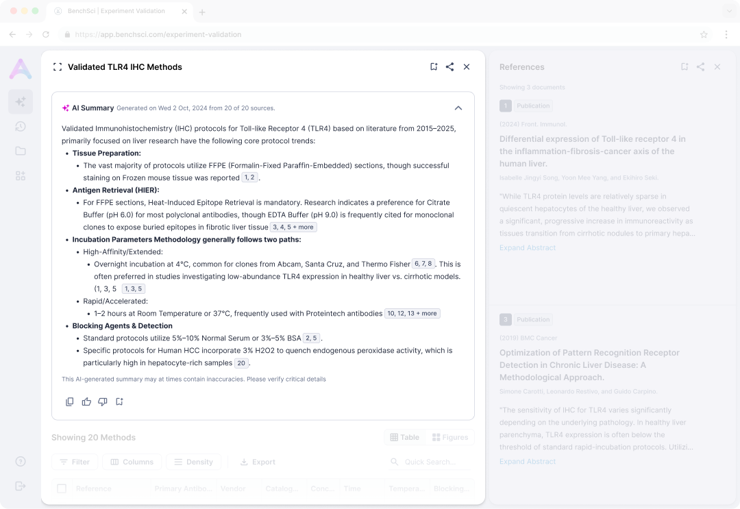
A streaming summary growing in real time pulls focus and pushes the table down. Collapsed by default, the table becomes the first impression and perceived latency stays low.
Citations are inline, numbered, and linked to evidence. Scientists who read every source needed the path to evidence to be one click, not a search.
Visual pivot to grid
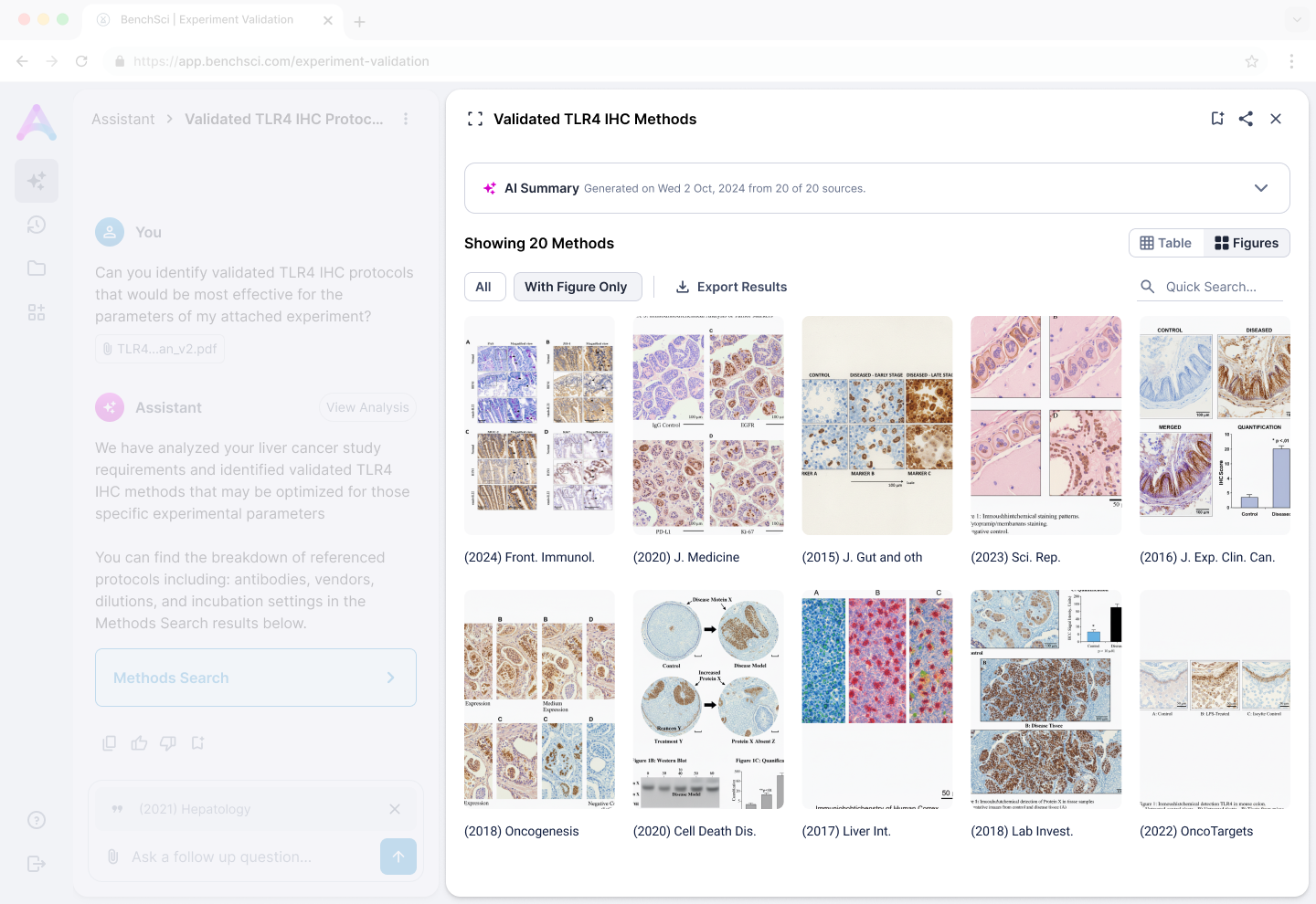
Same result set, two lenses: table for attribute scan and comparison, figure grid for visual quality assessment. The pivot lets scientists narrow without losing the working set.
Shipping decision
The full agentic platform was blocked on cross-team work: system prompt architecture, agentic framework, a unified data schema, and a new design system. Waiting meant years lost while enterprise conversations were already active.
The differentiator enterprises actually needed to see was not the agentic UI; it was the methods data and the direction. A standalone MVP on a composite data model — pulling from legacy and new infrastructure — let us ship that value cleanly with a single clear purpose, while the rest of the platform caught up.
Impact and reflection
Shipped the first GenAI feature at BenchSci and a focused MVP that supported the eight-figure Thermo Fisher partnership and reached 100K+ users. The journey framework was adopted by three other product teams without being pushed.
Trust for expert users is tied to agency and evidence access — designs that hide evidence behind AI narration fail this audience. Next time, I would surface data infrastructure constraints earlier so MVP scope is a planned move, not a discovered one.
Going beyond an agentic chat
As I observed scientist, I started to observe a surprising behaviour: they often asked questions about the table. This lead to a hypothesis around dynamic tables that would differentiate us from other generic chat products and would align more with scientists natural workflows.
If you're curious check out the agentic table prototype case study.
Next Case Study
BenchSci — Agentic Table